
Jul 3, 2025
•
Onton Team
Discover what harmony means in interior design and how to achieve a cohesive space. Explore examples and understand how unity and harmony work together.
Sometimes, you step into a space where everything just works — the colors complement each other, the textures feel curated, and the overall vibe is calming. Interior designers call that harmony. It’s a design principle that’s easier to notice than it is to define. If you’re asking yourself, “What does harmony mean in interior design?”, it’s all about creating a sense of flow and connection across a space.
In this guide, we’ll define what harmony means, how the concept differs from unity, and how to bring them both into your space.
What’s the definition of harmony in interior design?
Harmony in interior design is what gives a room that easy, pulled-together look. It’s the visual and emotional rhythm you feel when all the design elements — furniture, paint color schemes, lighting, materials, and decor — work together in a way that seems natural and intentional.
Interior designers create harmony by balancing cohesion and contrast. Design elements don’t have to match, but they should feel like they belong together. If harmony was personified, it would be a group of guests at a wedding party who aren’t dressed alike but share similar formal design cues. In an interior space, that might mean using a consistent color palette and pairing textures that complement one another.
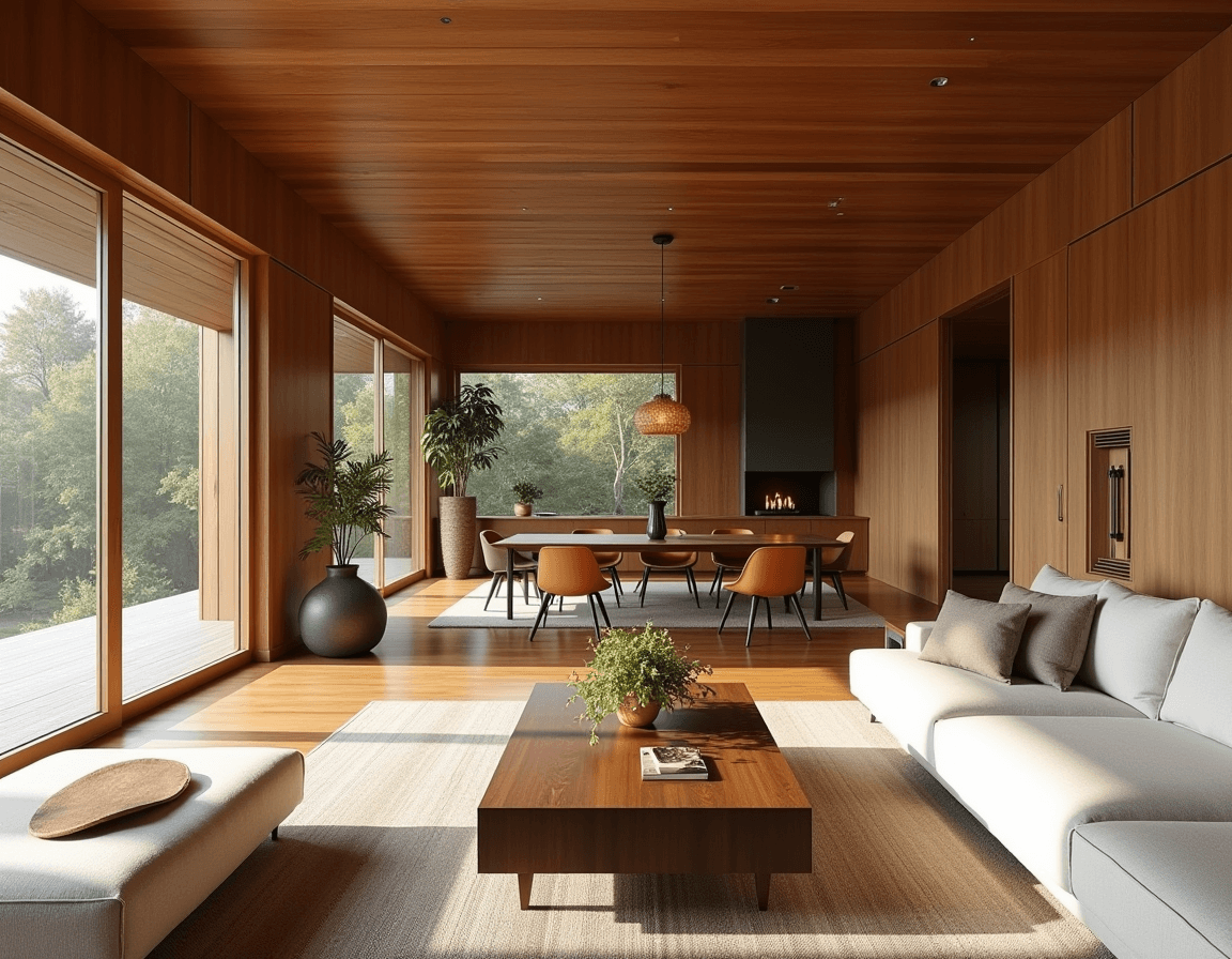
As an example of harmony in interior design, imagine a living room with a waffle weave throw blanket that echoes the geometric patterns in a rug and hard lines of mid-century modern furniture pieces. Together, they create harmony in a room through subtle repetition and rhythm. These design elements build harmony by bringing together texture and pattern to create visual balance.
What’s unity in interior design?
Unity is about making sure every part of a space — whether it’s a single room or the entire home — feels connected by the same design narrative. While harmony focuses on how individual design elements work together within a room, unity is about stepping back to ensure continuity flows across different areas of your home.
Think of unity as committing to a clear design style or mood throughout your interior space. For instance, in transitional interior design, you might blend classic and modern pieces. Picture a sleek Bauhaus-inspired sofa paired with traditional wood accents and then mimic that mix in the dining area with a minimalist table and hand-crafted wood chairs. The materials, color scheme, and mood stay consistent, even when the furniture pieces and decor evolve from room to room.
That’s unity — creating a sense of flow and visual continuity so the entire home feels like a cohesive experience.
Harmony and unity together: 7 interior design principles
Achieving harmony and unity in your home’s interior design doesn’t mean starting from scratch or making every room look the same. It’s about making a few smart, intentional choices that bring balance.
Whether styling a studio apartment or smoothing the feng shui between a living and dining area, here are seven tips to make your space more connected.
Stick to a curated color palette
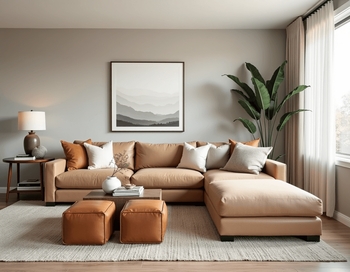
A cohesive color scheme is one of the easiest ways to create visual harmony. Start with a base palette of two to three core colors, then layer in variations through tone, texture, and material. For example, if you’re working with warm neutrals, you might paint the walls a soft greige, add a tan linen sofa, and include caramel leather accents on dining chairs and ottomans.
Choosing a base palette doesn’t mean your interior design will lack variety. You can choose a diverse color theme, like pastels, and carry it through the whole house. Think pale sage bathroom tiles, blush-toned paint in the bedroom, and lavender throw pillows in the living room, which together build a cheery, playful atmosphere. It’s less about being matchy-matchy and more about creating a subtle rhythm via repeated hues.
Layer with diverse textures

Interior design texture is where a room starts to feel as good as it looks. Harmonious texture happens when the tactile blend of materials — soft, smooth, bristly, glossy, rough — creates a space that’s inviting to the touch and interesting to the eye. Picture a bedroom with crisp linen sheets, a velvet bench at the foot of the bed, a wool throw blanket, and a leather headboard. Or imagine a kitchen that balances matte ceramic dishes, woven baskets, and polished stone counters.
Use natural light

Natural light intensifies texture, deepens color, and makes a space feel more lively. Pay attention to how light enters each room and the way it interacts with materials and finishes. Stone or marble objects can take on a pink hue in natural light, and wood can appear more fine.
Want to brighten a space? Add reflective materials like glass, lacquer, or satin-finished metals. Want to ground a room? Introduce heavy textures like raw wood, concrete, or boucle. Even something small — like swapping a basic planter for a rough ceramic — will add unique dimensions and contrast.
Look for boucle furniture pieces on Onton
Connect materials and finishes
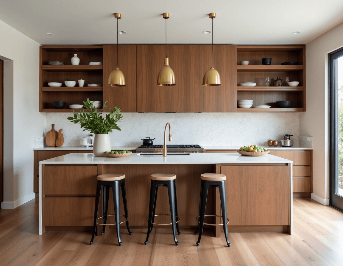
Repeating materials across rooms helps establish unity. If your kitchen has brushed brass hardware, try using that finish on a floor lamp or mirror frame in the adjacent living room. Got walnut cabinets? Let that wood tone show up again on a coffee table, headboard, or shelving unit to tie the house together.
Limit overly matchy-matchy sets

Repeat after us: symmetry good, matchy-matchy bad. When every piece of furniture has the same shape, material, and color, a room starts to feel more like a catalog display than a place people actually live. It loses its sense of depth and character, becoming flat and sterile.
Instead, aim for a curated look. Pair that tailored leather sofa with a couple of plush, rounded boucle chairs. Adorn matching bedside tables with unique decor, like a lamp on one and a sculptural vase on another. The goal isn’t chaos, it’s contrasts that feel thoughtful and tell a richer visual story.
Incorporate negative space

Achieving harmony requires leaving some breathing room between decor elements — that means resisting the urge to fill every wall. You can create negative space by choosing pieces with visual lightness, like a glass coffee table, floating shelves, or a sofa with thin legs. This helps reduce the viewer’s cognitive load when taking in the space, making them feel more calm.
Explore floating shelves on Onton
Ensure continuity between spaces

If your bedroom opens to a hallway or your living area flows into the kitchen, make sure there’s a thread connecting them. That could mean carrying your color palette into accessories (like navy throw pillows in the bedroom and navy picture frames in the living room) or echoing a design style throughout (like modern-style clean lines and organic shapes in all your furniture pieces).
Choose the right elements for a harmonious space with Onton
Not sure how to mix a curved boucle chair with that mid-century credenza? Let Onton’s AI-powered search engine help you find design elements that feel harmonious. Try prompts like “walnut cabinetry” or “minimalist dining set” to explore pieces that align with your vision.
Then, bring it all to life with Onton’s Imagine tool. Upload a photo of your space and experiment with color palettes, materials, and furniture combos to see how everything comes together before you commit.
Dream up your ideal harmonious home with Onton.